Calendar
(January)/February - Clone Stamp
|
|
|
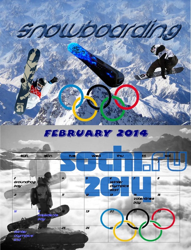
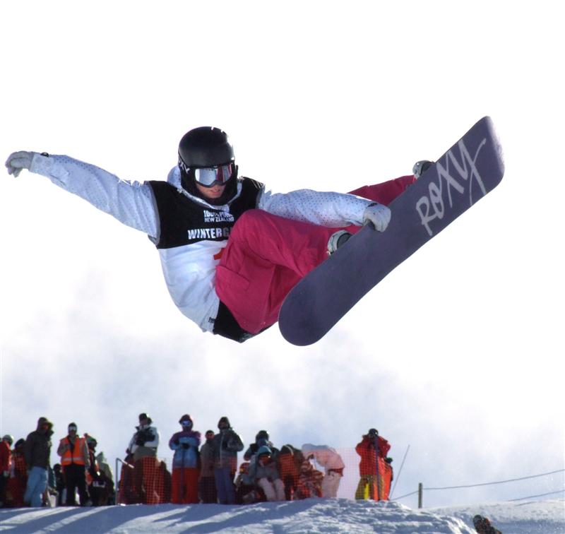
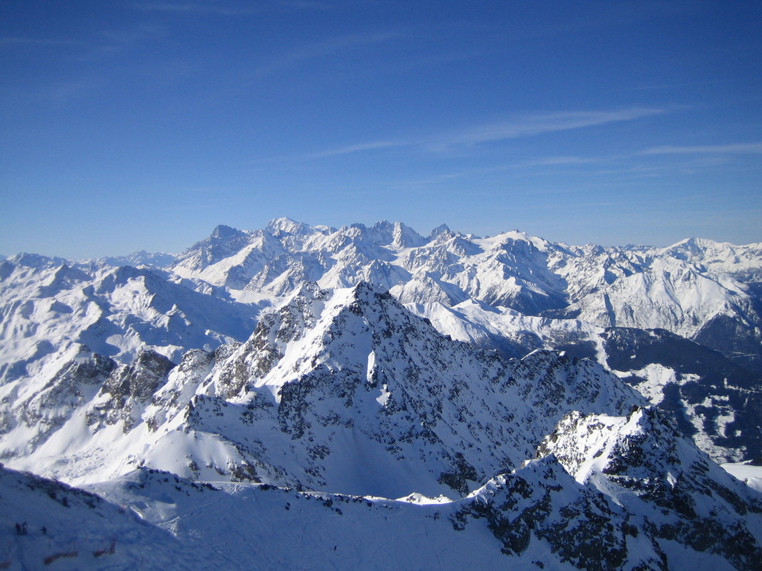
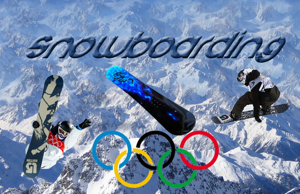
The images in the middle and on the left are the original images and the one on the right is the photo shopped one. With the image on the left i selected out the snowboarder and put him in the photo shopped slide. I also made the picture in the middle the background of the image to the right. In the image in the middle , i clone stamped the mountains where the sky was which made it seem like they were never ending and to create the illusion that they faded in the background. Also, on the finished image i typed out snowboarding in crystal lake font, added in another snowboarder, a snowboard and an Olympic symbol to describe my theme.
|
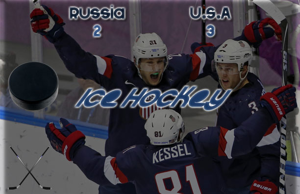
March/(April) - Blending Options
|
|
|
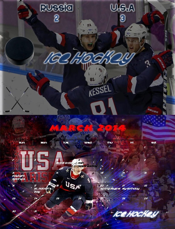
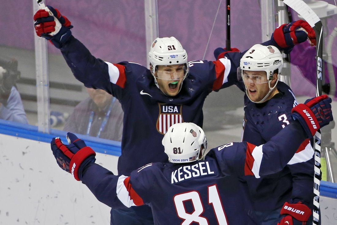
The middle and image on the left are the original images and the one on the right is the photo shopped one. I selected out the puck as well as the hockey sticks and put them in with my final image to display theme. I used the middle image as the background and added the satin blending option to darken it up. I also used the crystal lake font to type multiple things and added a white outer glow to all the words to bring them out more. I also skewed the words "ice hockey" to the right to make show some movement.
|
May/June - Gradient or Pattern
|
|
|
|
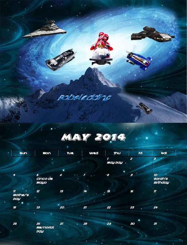
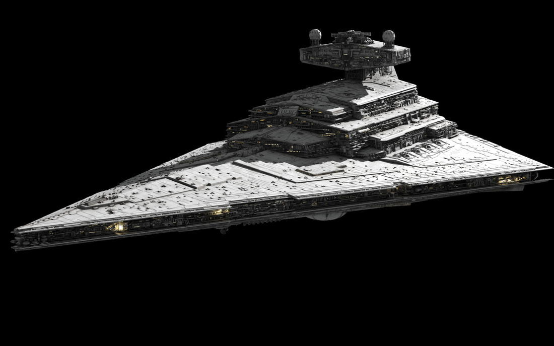
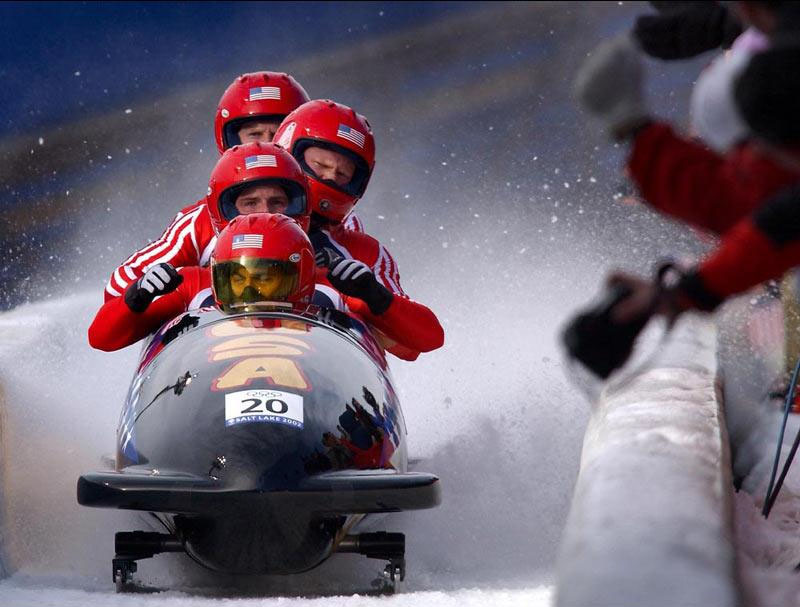
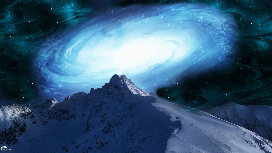
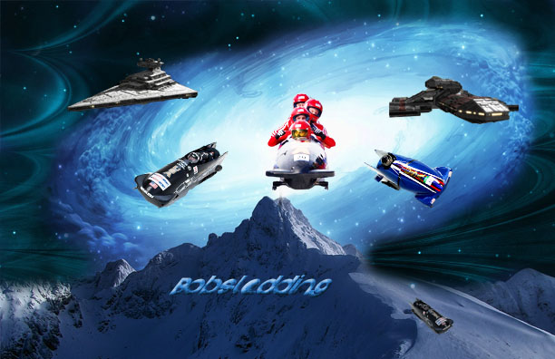
The picture to the right is the completed version of the may art and all of the photo's before that are the images i used, with the addition to others, to create said image. After downloading a pattern off brusheezy, i used the blue pattern around the galaxy demonstrated in picture #3 to make a brighter space look to the picture. I then used different bobsleds such as the one in picture #2 to make it look like they were coming out of the galaxy. The spaceship from picture #1 was use along with another spaceship to add to the theme of all these space ships and bobsled "ships" coming out of the galaxy as like a spaceship fleet. This and the mountain in the background help demonstrate a winter theme as well as a winter Olympic bobsled theme.
|
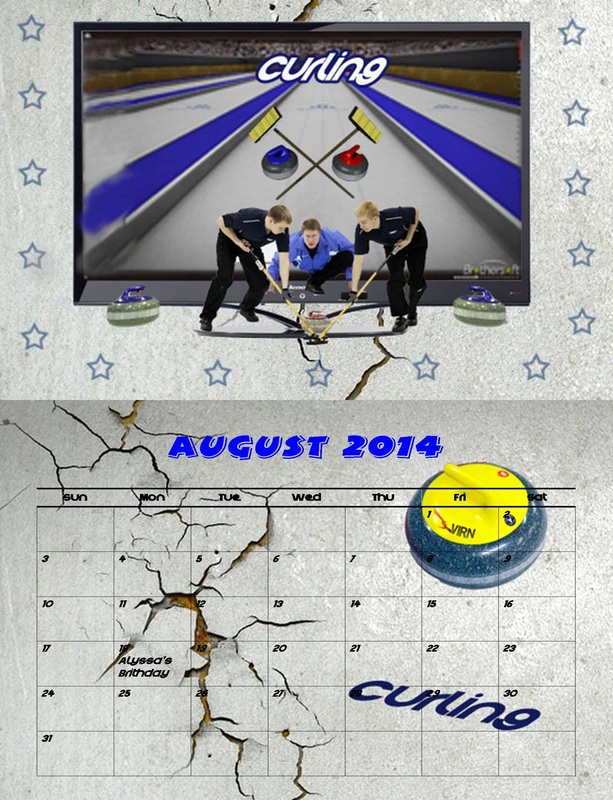
(July)/August - brushes and stamps/ type on a path
|
|
|
|
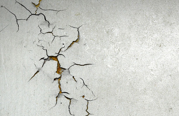
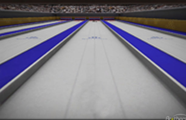
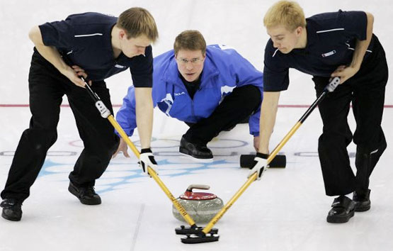
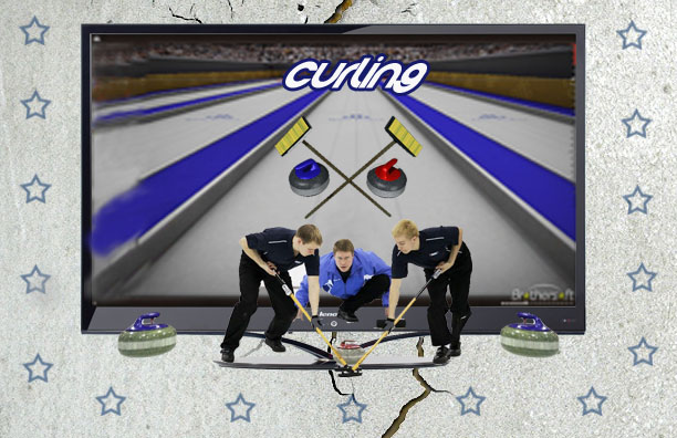
I used all the pictures to the left to create the final image on the right, closest to this text. I used the cracked wall as the overall background, the curling rink as what was displayed on the tv (only included in final photo), and the people actually curling were all photo shopped and selected out into one image. I also selected out some other curling rocks and used the brush tool for the stars on the outside. Along with typing "curling" in crystal lake font, i put a blue stroke to outline that text to bring it out more and use the crossed sweepers to bring out the curling theme. The whole point was to show that he people were curling outside the tv to make it look 3-d.
|
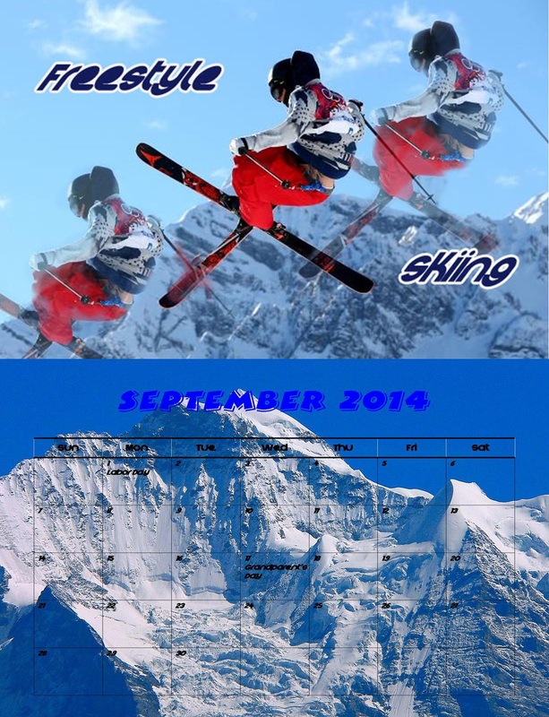
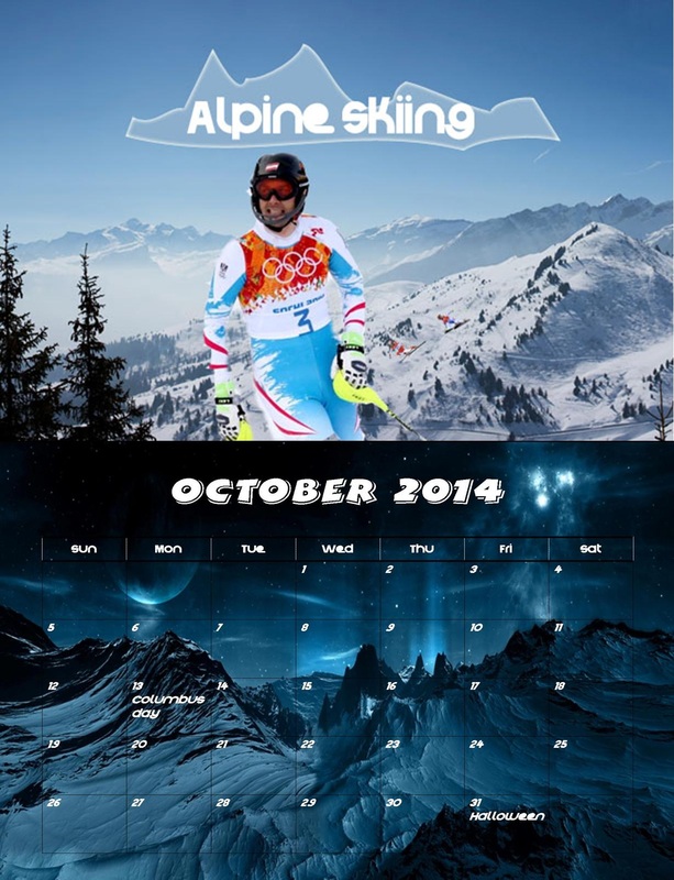
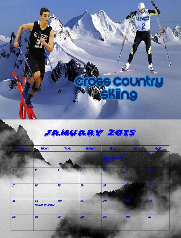
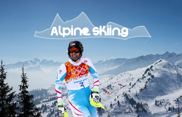
(September)/ October - free transform pen tool
|
|
|
The middle picture and picture on the left are he original images of the final copy on the right. I selected out the guy from the middle picture to be the main emphasis of the art and made the first picture the background of the whole piece. Although they aren't included and cannot be seen, i out two more little skiers in the background to make it look like they were racing each other. In this part of the project i had to use the free transform pen tool. While typing "Alpine Skiing", i used the free transform pen tool to make it look like mountains in the background. This in turn brings out the words more and allows for more activity in the picture.
|
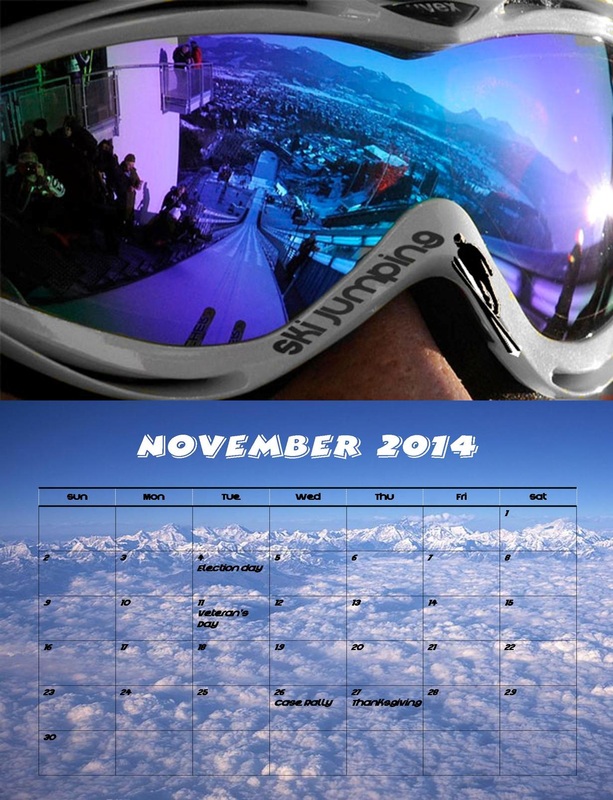
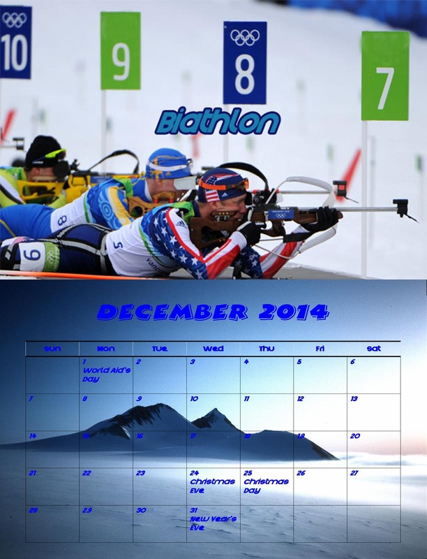
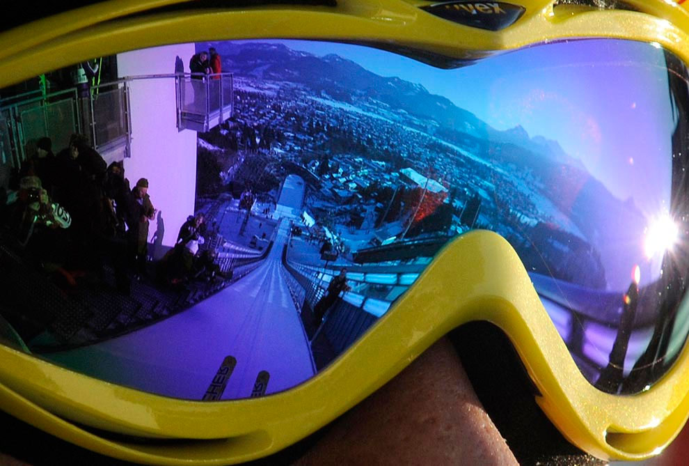
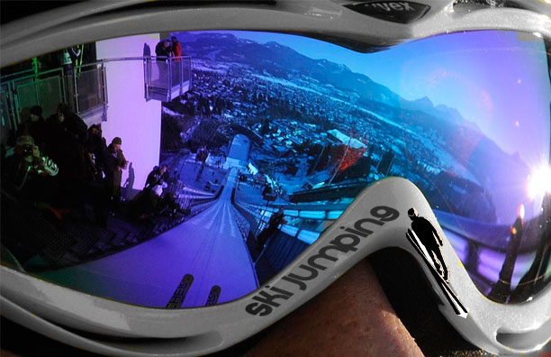
November/(December) - color replacement tool & Dodge and Burn
|
|
|
The image in the middle and image on the left are the original images in which combined. I selected out the picture in the middle and adjusted the size/angle, and put it on the rim of the guys goggles. I used the color replacement tool to make the outer rim of the goggles a silver color rather than a yellow color. Lastly i typed out ski jumping which is the theme of the art, and adjusted it so it would appear on the outer rim of the goggles. I also used color replacement of that but made it a tad darker. That completed the final art which is on the right.
|
